
Content
Raseet Health
Raseet Health
Raseet Health is an intuitive platform for pharmacies, catering to users of all ages and tech levels, with a focus on a broad audience.
Raseet Health is an intuitive platform for pharmacies, catering to users of all ages and tech levels, with a focus on a broad audience.

Responsibilities
Responsibilities
Brainstorming
Design Strategy
Ideation
Rapid Prototyping
Visual Design
Brainstorming
Design Strategy
Ideation
Rapid Prototyping
Visual Design
Brainstorming
Design Strategy
Ideation
Rapid Prototyping
Visual Design
Headquarters
Headquarters
Figma
Miro
Adobe Creative Suite
Figma
Miro
Adobe Creative Suite
Figma
Miro
Adobe Creative Suite
Founded
Founded
UX design
UX research
Workshop facilitator
UX design
UX research
Workshop facilitator
UX design
UX research
Workshop facilitator
Timeline:
Timeline:
Overall: 8+ weeks
Research: 2+ weeks
Design & testing: 6 weeks
Overall: 8+ weeks
Research: 2+ weeks
Design & testing: 6 weeks
Overall: 8+ weeks
Research: 2+ weeks
Design & testing: 6 weeks
Overview
Designed an e-commerce pharma app keeping simplicity and an intuitive interface as the prime objective. It lets a wide range of users irrespective of age and technical proficiency easily order medications and wellness products or refill their chronic prescriptions.
Problem
We understood that most chronic patients do repeat orders frequently, hence, it helped us create a user flow, to order via our “Quick Order” interface. We also comprehended the pain points of elderly patients, who generally have to depend on a younger individual to order medicines online or choose the convenient online purchase method. To improve upon this we ensured that our user flow was purposely kept simple, important information was communicated clearly and the app was generally easy to use.
Solution
This resulted in a 13% increase in customer retention and a way forward for the customers despite the application rejection.
Opting for an easy-to-use UX.
Clearly outlining and providing crucial information.
Providing a “Quick Order” interface.
Metric Number 1.
Metric Title 1.
25%
Metric Title 2.
84%
Metric Title 3.

Design Process
The Design Process involved research, ideation, prototyping, testing, and implementation. The process was iterative, meaning that we went back and forth between steps to make changes or adjustments based on feedback and testing. The goal of the design process was to create an app that was intuitive to use with almost zero learning curve, at the same time aesthetically pleasing and invoking emotions similar to that of interacting with a caretaker.
The Design Process involved research, ideation, prototyping, testing, and implementation. The process was iterative, meaning that we went back and forth between steps to make changes or adjustments based on feedback and testing. The goal of the design process was to create an app that was intuitive to use with almost zero learning curve, at the same time aesthetically pleasing and invoking emotions similar to that of interacting with a caretaker.
The Design Process involved research, ideation, prototyping, testing, and implementation. The process was iterative, meaning that we went back and forth between steps to make changes or adjustments based on feedback and testing. The goal of the design process was to create an app that was intuitive to use with almost zero learning curve, at the same time aesthetically pleasing and invoking emotions similar to that of interacting with a caretaker.
01
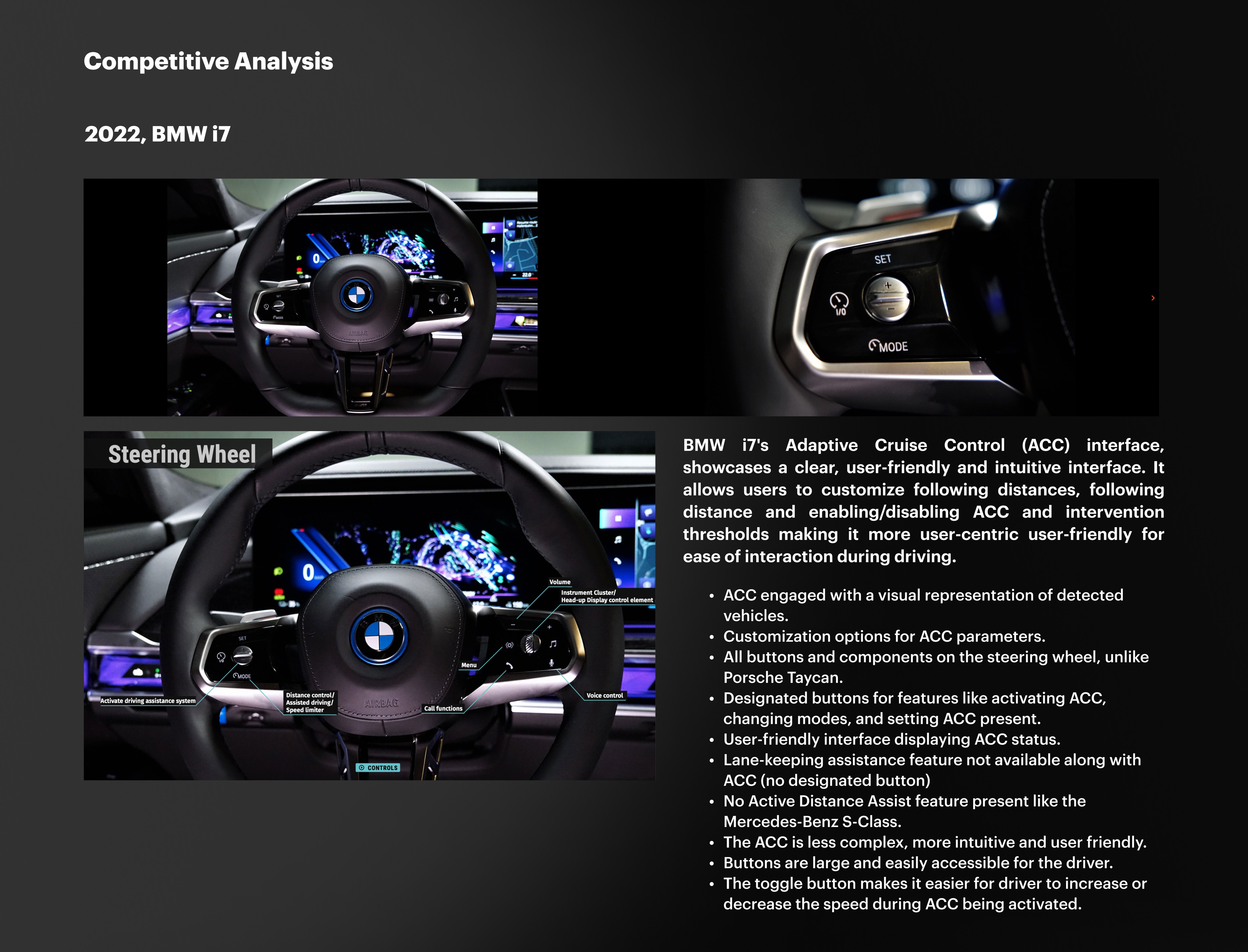
2022, BMW i7
BMW i7's Adaptive Cruise Control (ACC) interface, showcases a clear, user-friendly and intuitive interface. It allows users to customize following distances, following distance and enabling/disabling ACC and intervention thresholds making it more user-centric user-friendly for ease of interaction during driving.
02
2020, Mercedes-Benz S-Class
We conducted user interviews, surveys, and analyzed in-app analytics to understand the pain points and user needs. We also studied competitor apps and industry trends to gather insights
03
2019, Porche Taycan
We conducted user interviews, surveys, and analyzed in-app analytics to understand the pain points and user needs. We also studied competitor apps and industry trends to gather insights
04
Takeaways & Considerations
We conducted user interviews, surveys, and analyzed in-app analytics to understand the pain points and user needs. We also studied competitor apps and industry trends to gather insights

Target Audience
The Design Process involved research, ideation, prototyping, testing, and implementation. The process was iterative, meaning that we went back and forth between steps to make changes or adjustments based on feedback and testing. The goal of the design process was to create an app that was intuitive to use with almost zero learning curve, at the same time aesthetically pleasing and invoking emotions similar to that of interacting with a caretaker.
The Design Process involved research, ideation, prototyping, testing, and implementation. The process was iterative, meaning that we went back and forth between steps to make changes or adjustments based on feedback and testing. The goal of the design process was to create an app that was intuitive to use with almost zero learning curve, at the same time aesthetically pleasing and invoking emotions similar to that of interacting with a caretaker.
The Design Process involved research, ideation, prototyping, testing, and implementation. The process was iterative, meaning that we went back and forth between steps to make changes or adjustments based on feedback and testing. The goal of the design process was to create an app that was intuitive to use with almost zero learning curve, at the same time aesthetically pleasing and invoking emotions similar to that of interacting with a caretaker.
Target Solution
A User Flow Is A Visual Representation Of The Steps And Actions A User Takes To Complete A Task On A Website Or Mobile App, Mapping Out Their Journey Through The Product And Helping To Identify problems in The User Experience
A User Flow Is A Visual Representation Of The Steps And Actions A User Takes To Complete A Task On A Website Or Mobile App, Mapping Out Their Journey Through The Product And Helping To Identify problems in The User Experience
A User Flow Is A Visual Representation Of The Steps And Actions A User Takes To Complete A Task On A Website Or Mobile App, Mapping Out Their Journey Through The Product And Helping To Identify problems in The User Experience
User Interviews
User Interviews were a key step in the designing of the app. They provided valuable insights about the ease of use of the app and the target audience’s technical know-how.We conducted interviews amongst different categories of people across all age groups primarily focusing on chronic patients and the elderly. We understood the need to have an easy-to-use interface, especially for the elderly and the business potential of chronic patients.
“…create requirements so I can clearly define what type of person we are looking for”.
“…save the job I’m creating as a draft So I can return later to finalize the changes”.
“…create different levels for resume matching. This way, I can sort a list of potential candidates according to what level of match they fit into”.
“…assign a job category for a new job, so I can have similar type of jobs grouped together”.
“…make job requirements mandatory or optional, so that I can give priority to certain skill sets over others”.
“…view a summary of the job I created, so I can review it before publishing”.
Comparative Analysis

1 mg
1mg is a pharmacy application that provides specialized and generic medicines along with branded medicines
1. Home delivery of medicines
2. Medicines calculator
3. Provides 24-hours
4. Appointment Options
5. Provides doctor consultations
1mg is a pharmacy application that provides specialized and generic medicines along with branded medicines
1. Home delivery of medicines
2. Medicines calculator
3. Provides 24-hours
4. Appointment Options
5. Provides doctor consultations
1mg is a pharmacy application that provides specialized and generic medicines along with branded medicines
1. Home delivery of medicines
2. Medicines calculator
3. Provides 24-hours
4. Appointment Options
5. Provides doctor consultations
PharmEasy
Pharmeasy is another famous online pharmacy & medical store offering pharmaceutical and healthcare products.
1. Home delivery of medicines
2. Medicines calculator
3. Provides 24-hours
4. Appointment Options
5. Provides doctor consultations
Pharmeasy is another famous online pharmacy & medical store offering pharmaceutical and healthcare products.
1. Home delivery of medicines
2. Medicines calculator
3. Provides 24-hours
4. Appointment Options
5. Provides doctor consultations
Pharmeasy is another famous online pharmacy & medical store offering pharmaceutical and healthcare products.
1. Home delivery of medicines
2. Medicines calculator
3. Provides 24-hours
4. Appointment Options
5. Provides doctor consultations


Zeno Health
Zeno Health is a Mumbai-based pharmacy application that provides generic medicines and branded medicines.
1. Home delivery of medicines
2. Provides doctor consultations
Zeno Health is a Mumbai-based pharmacy application that provides generic medicines and branded medicines.
1. Home delivery of medicines
2. Provides doctor consultations
Zeno Health is a Mumbai-based pharmacy application that provides generic medicines and branded medicines.
1. Home delivery of medicines
2. Provides doctor consultations
User Journey
In the user journey for Raseet Health, users first become aware of the app through marketing or word of mouth, leading them to download it from the app store. The onboarding process focuses on simplicity and highlights key features, ensuring ease of use for chronic patients and the elderly. After setting up a profile, users navigate the app's user-friendly interface to search for medicines, with the "Quick Order" option streamlining the repetitive ordering process for chronic patients.
The app addresses the challenge of information obscurity by providing clear and concise details about prescribed medicines. The checkout process is straightforward, fostering trust, and real-time delivery tracking enhances convenience. The iterative design process, informed by user interviews, allows for continuous improvements based on user feedback. Through personalized suggestions and offers, the app aims to build loyalty among chronic patients and the elderly, making it their preferred platform for medicine orders.

Personas
We wanted to form a deeper understanding of our users' goals, needs, experiences, and behaviors. So, we created personas for each of our user segments. They were based on user interviews and surveys, and we kept updating them throughout the project as we gathered more data. We used these personas whenever we wanted to step out of ourselves and reconsider our initial ideas.
We wanted to form a deeper understanding of our users' goals, needs, experiences, and behaviors. So, we created personas for each of our user segments. They were based on user interviews and surveys, and we kept updating them throughout the project as we gathered more data. We used these personas whenever we wanted to step out of ourselves and reconsider our initial ideas.
We wanted to form a deeper understanding of our users' goals, needs, experiences, and behaviors. So, we created personas for each of our user segments. They were based on user interviews and surveys, and we kept updating them throughout the project as we gathered more data. We used these personas whenever we wanted to step out of ourselves and reconsider our initial ideas.

Taskflow

5 Why Analysis?

Storyboard

Wireframes & Prototypes
Wireframes
Using Figma, I translated my first sketches into low-fidelity wireframes. Then, I improved them by adding a few relevant stock images and copies provided by the marketing team. At this stage, the wireframes were defined enough for some user testing. Based on 4 tests, I’ve made a few alternations and moved on to creating high-fidelity prototypes.
Using Figma, I translated my first sketches into low-fidelity wireframes. Then, I improved them by adding a few relevant stock images and copies provided by the marketing team. At this stage, the wireframes were defined enough for some user testing. Based on 4 tests, I’ve made a few alternations and moved on to creating high-fidelity prototypes.
Using Figma, I translated my first sketches into low-fidelity wireframes. Then, I improved them by adding a few relevant stock images and copies provided by the marketing team. At this stage, the wireframes were defined enough for some user testing. Based on 4 tests, I’ve made a few alternations and moved on to creating high-fidelity prototypes.

Low-Fi Prototypes
Using Figma, I translated my first sketches into low-fidelity wireframes. Then, I improved them by adding a few relevant stock images and copies provided by the marketing team. At this stage, the wireframes were defined enough for some user testing. Based on 4 tests, I’ve made a few alternations and moved on to creating high-fidelity prototypes.
Using Figma, I translated my first sketches into low-fidelity wireframes. Then, I improved them by adding a few relevant stock images and copies provided by the marketing team. At this stage, the wireframes were defined enough for some user testing. Based on 4 tests, I’ve made a few alternations and moved on to creating high-fidelity prototypes.
Using Figma, I translated my first sketches into low-fidelity wireframes. Then, I improved them by adding a few relevant stock images and copies provided by the marketing team. At this stage, the wireframes were defined enough for some user testing. Based on 4 tests, I’ve made a few alternations and moved on to creating high-fidelity prototypes.

UI Design
Once the usability issues were resolved, I moved on to design the final screens in Figma. My goal was to create a visual identity that’s aligned with the brand’s values and message, which is: “brand motto”. Also, I’ve checked the competition and took a deep dive into my catalog of references for inspiration.
1. What kind of visual style did you follow and why? (Fresh, corporate, dark, light?)
2. Did you follow any popular guidelines? (Material Design, iOS Styleguide, etc?)
3. What platforms and devices did you design for?
4. How does your final design reflect your learnings about your users?

Connect to Content
Add layers or components to infinitely loop on your page.
Figma Prototype
Trusted by Professionals
While most of my client reviews are NDA-protected (because, you know, top-secret agency white label stuff), I managed to sneak in a few favorites from my previous partners.
Connect to Content
Add layers or components to infinitely loop on your page.
Nicey © 2023. Designed by Goran Babarogic
Get in touch!
If you are in pursuit of a designer committed to turning challenges into delightful experiences, let's talk!
iamhtk@umich.edu
EXPLORE


© 2025 • Handmade with Figma, Framer, and love ❤️
Get in touch!
If you are in pursuit of a designer committed to turning challenges into delightful experiences, let's talk!
iamhtk@umich.edu
EXPLORE
© 2025 • Handmade with Figma, Framer, and love ❤️
Get in touch!
If you are in pursuit of a designer committed to turning challenges into delightful experiences, let's talk!
iamhtk@umich.edu
EXPLORE
© 2025 • Handmade with Figma, Framer, and love ❤️